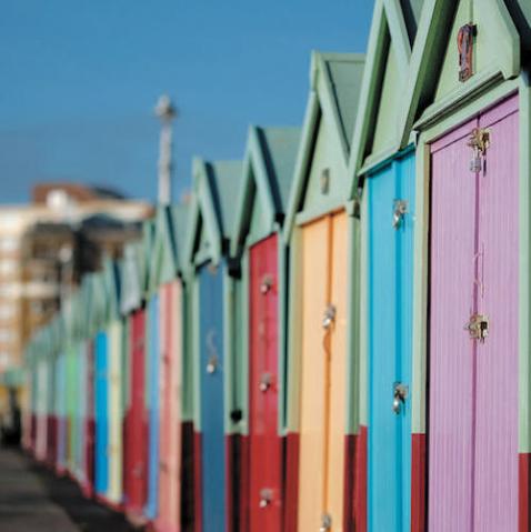
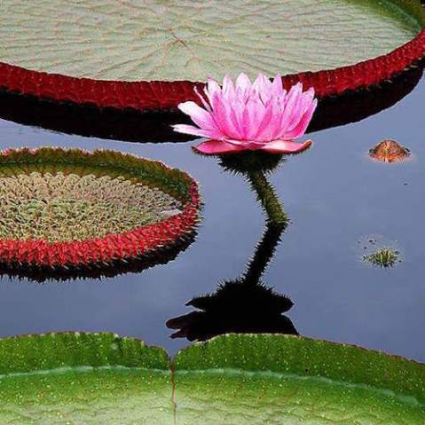
Hue, saturation, and brightness: the language of colour
For the purposes of most creative photography it’s not so important that we are able to describe colours accurately, which is a relief, given how tricky it can be. But it is very important that we learn to see colours for what they really are if we are to have any hope of capturing them, processing them to match our vision and then printing them so that the final prints look the way that the colours appeared in person.
 Placing colourful subjects on black backgrounds will enhance their saturation.
Colour vocabulary
Colour has a language, and its vocabulary can help a great deal when it comes to seeing and describing colour in a universal tongue. Colour is technically described and defined as having three specific attributes: hue, saturation, and brightness, or HSB (and often referred to as HSV with brightness being replaced with value—a different term for the same thing). These three terms are the vocabulary of colour and knowing how to use them will help you to not only share your ideas of colours with others, but also to identify subtle variations in the colours of the objects and scenes around you.
 Foggy scenes have inherently less saturation because the fog scatters the light and that scattering in turn diffuses the intensity of the colours and softens the contrast.
Hue
Hue is the more accurate term for what people mean when they describe the colour of something. The hue of lemon, for example, is yellow and the hue of a red apple is red. Though few of us use the term in casual conversation, ‘hue’ is the word that we mean when we describe the colour of any object. The concept of hue gets a bit more complicated when the colours we’re trying to describe are blends of various colours or when the colour comes from a palette this is not particularly ordinary.
 Skies often appear most saturated at dusk and in the twenty minutes or so after the sun has dipped below the horizon. Underexposure will increase the saturation significantly.
Saturation
Saturation (sometimes referred to as chroma) is a word that describes the purity of a particular hue. The colours coming out of a prism are fully saturated, but pure colours are relatively rare. A painter can desaturate the purity of a colour by adding paint to it (or by mixing it with its complement, which will create a muddier hue). In fact, if you look at most painter’s kits, you’ll see that the largest tube of paints is usually white because lightening the saturation of colour is a key element of paint mixing.
Lighting and time of day will have a major impact on colour and saturation, but the simplest way to either add or subtract saturation is after-the-fact in editing.
In the photographic world, however, pure colours are rare because they are affected by a lot of impure factors including things like mist or haze, the natural fading of pigmented surfaces (the faded colours of an old barn, for example), and the intensity of the light that is illuminating them. Colours lit by midday light, for example, usually seem more pure because the colour of the light is more neutral and because (with certain surfaces, at least) the intensity of the lighting appears to saturate the colours. But too much light can actually take saturation away by creating too much surface reflection—particularly with glossy surfaces. Exposure also has an effect on saturation with even slight over- or underexposure often radically altering saturation.Brightness
Brightness refers to the lightness or darkness of a colour. The range for brightness, of course, is from black to white and the brightness of particular colour is dictated by a few things, most notably the amount of light hitting them (any colour seems darker in a dimly-lit room, for example) and also by exposure—with overexposed subjects appearing my lighter in tone. In editing it’s a simple process to alter the brightness of a colour by simply adding or taking away black. If you have Photoshop, for example, just open the selective colour tool and go to the Blacks slider (at the bottom of each colour) and either add or subtract black. You can also do the same thing in the hue/saturation tool by using the lightness option at the bottom of the dialogue box.
Exposure has a profound effect on the brightness of the colours in a given image. Adjustments toward the underexposed side muddy the hues and push darker hues toward black, while a shift toward overexposure washes out the middle and lighter hues.
The Photographer’s Master Guide to Color is Jeff Wignall’s thorough course on colour and the role it plays in digital photography, giving you a new understanding of the important role colour plays in the creation of successful photos, and allowing you take outstanding colour photographs with any digital camera.
 The Photographer’s Master Guide to Colour
Jeff Wignall
Buy now!


